Professional-Data-Engineer Google Professional Data Engineer Exam Free Practice Exam Questions (2025 Updated)
Prepare effectively for your Google Professional-Data-Engineer Google Professional Data Engineer Exam certification with our extensive collection of free, high-quality practice questions. Each question is designed to mirror the actual exam format and objectives, complete with comprehensive answers and detailed explanations. Our materials are regularly updated for 2025, ensuring you have the most current resources to build confidence and succeed on your first attempt.
Your organization has two Google Cloud projects, project A and project B. In project A, you have a Pub/Sub topic that receives data from confidential sources. Only the resources in project A should be able to access the data in that topic. You want to ensure that project B and any future project cannot access data in the project A topic. What should you do?
You need to migrate a 2TB relational database to Google Cloud Platform. You do not have the resources to significantly refactor the application that uses this database and cost to operate is of primary concern.
Which service do you select for storing and serving your data?
You are a head of BI at a large enterprise company with multiple business units that each have different priorities and budgets. You use on-demand pricing for BigQuery with a quota of 2K concurrent on-demand slots per project. Users at your organization sometimes don’t get slots to execute their query and you need to correct this. You’d like to avoid introducing new projects to your account.
What should you do?
Your company's customer_order table in BigOuery stores the order history for 10 million customers, with a table size of 10 PB. You need to create a dashboard for the support team to view the order history. The dashboard has two filters, countryname and username. Both are string data types in the BigQuery table. When a filter is applied, the dashboard fetches the order history from the table and displays the query results. However, the dashboard is slow to show the results when applying the filters to the following query:

How should you redesign the BigQuery table to support faster access?
You work for an advertising company, and you’ve developed a Spark ML model to predict click-through rates at advertisement blocks. You’ve been developing everything at your on-premises data center, and now your company is migrating to Google Cloud. Your data center will be migrated to BigQuery. You periodically retrain your Spark ML models, so you need to migrate existing training pipelines to Google Cloud. What should you do?
You need to modernize your existing on-premises data strategy. Your organization currently uses.
• Apache Hadoop clusters for processing multiple large data sets, including on-premises Hadoop Distributed File System (HDFS) for data replication.
• Apache Airflow to orchestrate hundreds of ETL pipelines with thousands of job steps.
You need to set up a new architecture in Google Cloud that can handle your Hadoop workloads and requires minimal changes to your existing orchestration processes. What should you do?
A live TV show asks viewers to cast votes using their mobile phones. The event generates a large volume of data during a 3 minute period. You are in charge of the Voting restructure* and must ensure that the platform can handle the load and Hal all votes are processed. You must display partial results write voting is open. After voting doses you need to count the votes exactly once white optimizing cost. What should you do?
The marketing team at your organization provides regular updates of a segment of your customer dataset. The marketing team has given you a CSV with 1 million records that must be updated in BigQuery. When you use the UPDATE statement in BigQuery, you receive a quotaExceeded error. What should you do?
You are planning to use Cloud Storage as pad of your data lake solution. The Cloud Storage bucket will contain objects ingested from external systems. Each object will be ingested once, and the access patterns of individual objects will be random. You want to minimize the cost of storing and retrieving these objects. You want to ensure that any cost optimization efforts are transparent to the users and applications. What should you do?
Your company has recently grown rapidly and now ingesting data at a significantly higher rate than it was previously. You manage the daily batch MapReduce analytics jobs in Apache Hadoop. However, the recent increase in data has meant the batch jobs are falling behind. You were asked to recommend ways the development team could increase the responsiveness of the analytics without increasing costs. What should you recommend they do?
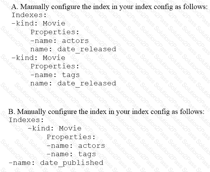
You are deploying a new storage system for your mobile application, which is a media streaming service. You decide the best fit is Google Cloud Datastore. You have entities with multiple properties, some of which can take on multiple values. For example, in the entity ‘Movie’ the property ‘actors’ and the property ‘tags’ have multiple values but the property ‘date released’ does not. A typical query would ask for all movies with actor=
Your company is loading comma-separated values (CSV) files into Google BigQuery. The data is fully imported successfully; however, the imported data is not matching byte-to-byte to the source file. What is the most likely cause of this problem?
You work for a manufacturing plant that batches application log files together into a single log file once a day at 2:00 AM. You have written a Google Cloud Dataflow job to process that log file. You need to make sure the log file in processed once per day as inexpensively as possible. What should you do?
You are designing the database schema for a machine learning-based food ordering service that will predict what users want to eat. Here is some of the information you need to store:
The user profile: What the user likes and doesn’t like to eat
The user account information: Name, address, preferred meal times
The order information: When orders are made, from where, to whom
The database will be used to store all the transactional data of the product. You want to optimize the data schema. Which Google Cloud Platform product should you use?
You work for a large fast food restaurant chain with over 400,000 employees. You store employee information in Google BigQuery in a Users table consisting of a FirstName field and a LastName field. A member of IT is building an application and asks you to modify the schema and data in BigQuery so the application can query a FullName field consisting of the value of the FirstName field concatenated with a space, followed by the value of the LastName field for each employee. How can you make that data available while minimizing cost?
You work for an economic consulting firm that helps companies identify economic trends as they happen. As part of your analysis, you use Google BigQuery to correlate customer data with the average prices of the 100 most common goods sold, including bread, gasoline, milk, and others. The average prices of these goods are updated every 30 minutes. You want to make sure this data stays up to date so you can combine it with other data in BigQuery as cheaply as possible. What should you do?