Analytics-DA-201 Salesforce Certified Tableau Data Analyst Free Practice Exam Questions (2026 Updated)
Prepare effectively for your Salesforce Analytics-DA-201 Salesforce Certified Tableau Data Analyst certification with our extensive collection of free, high-quality practice questions. Each question is designed to mirror the actual exam format and objectives, complete with comprehensive answers and detailed explanations. Our materials are regularly updated for 2026, ensuring you have the most current resources to build confidence and succeed on your first attempt.
A Data Analyst has created a Tableau Prep flow that is ready to be used. The output will be used by a colleague to build a dashboard on Tableau Cloud or Tableau Server.
Where should the analyst output the data to?
You have the following dataset in Microsoft Excel.
You are using Data interpreter to cleans the dataset. Data interpreter provides the following results.
How many rows of data will be ingested into Tableau as values?
You have a dashboard that contains a parameter named Start Date.
You need to create an extract from a Microsoft Excel file. The extract must be filtered based on Start Date.
What should you do?
A Data Analyst needs to calculate the first Tuesday of each month in the data.
Which set of functions should the analyst use to perform this calculation?
A Data Analyst is creating an annual report in Microsoft Word.
In Tableau Desktop, the analyst built a chart in a worksheet.
The analyst wants to create an image of the chart to add to the annual report.
Which two options should the analyst use to create the image? (Choose two.)
The following table displays the row-level data in a Tableau data source:
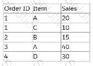
A Data Analyst creates this calculated field:
SUM(IF [Item] = 'A' THEN [Sales] END) / COUNT([Order ID])
What is the result of this aggregate calculation?
You have the following map.
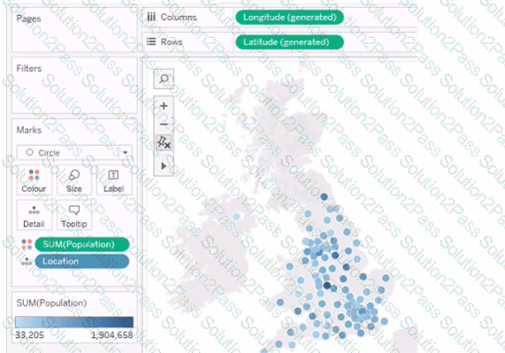
You need the map to appear as shown in the following visualization.
What should you do?
You have the following table.
You need each record to alternate between grey and white.
What should you change in the Format Shading pane?
You have a data source that contains data tor every city in the Unites States. The following is a sample of the data.
You need to use the City dimension to create a dynamic filter that snows the cities that have a population greater than one million Which type of filter should you use?
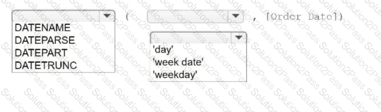
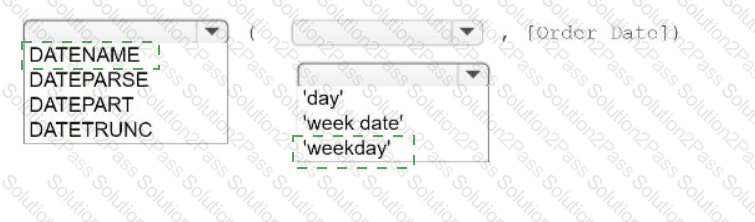
You have a table that contains four columns named Order Date, Country, Sales, and Profit.
You need to add a column that shows the day of the week for each row. For example, orders placed on August 31, 2022, will show a day of
Wednesday.
How should you complete the formula? (Use the dropdowns in the Answer Area to select the correct options to complete the formula.)
You have a blank dashboard.
You want to add two sheets to the dashboard. The sheets must support the Show/Hide button.
To which two objects can you add the sheets? (Click the two appropriate Options in the Answer Area.)
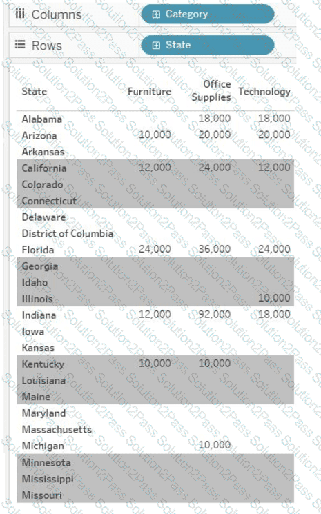
A Data Analyst wants to create the following table in a view:
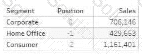
Which function should the analyst use to create the Position column?
A Data Analyst creates a parameter named Choose Region that contains values from a field named Region.
The analyst wants users to be able to use the Choose Region parameter to interact with a chart by toggling between different regions.
What should the analyst do next?
You have the following dataset that contain null values in the Profits field.
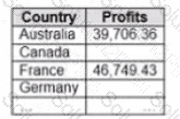
You want the data to appear as shown in the following table.
Which two formulas achieve the goal? Choose two.
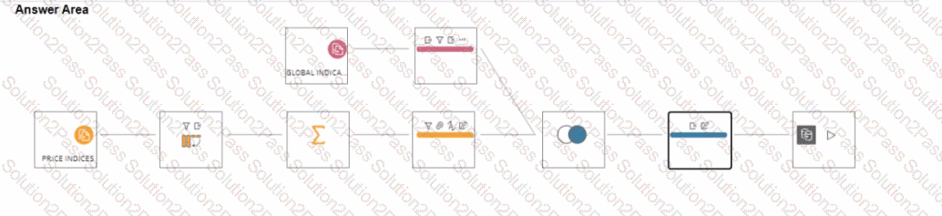
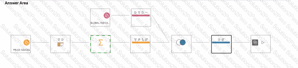
You have a Tableau Prep flow that joins a dataset named Global Indicators to a dataset named Price Indices.
In which step can you transform rows of monthly data into rows of yearly data''
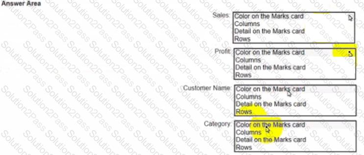
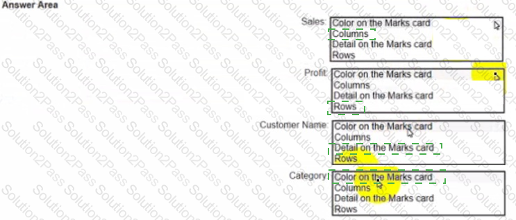
You have a dataset that has four fields named Category. Profit Sates and Customer Name. You need to create the following visualization.
Open the link to Book1 found on the desktop. Open the Line worksheet.
Modify the chart to show only main and max values of both measures in each region.
Open the link to Book1 found on the desktop. Open the Histogram worksheet and use the Superstone data source.
Create a histogram on the Quantity field by using bin size of 3.
Open the link to Book1 found on the desktop. Open Disciplines worksheet.
Filter the table to show the Top 10 NOC based on the number of medals won.
Open the Link to Book1 found on the desktop. Open Map worksheet and use Superstore data source.
Create a filed map to show the distribution of total Sales by State across the United States.